
Should a charity use AI to design its logo?
Article Summary:
AI logo tools are faster, cheaper, and more capable than most people realise. And they're improving quickly. But for charities considering whether to use them, the real question isn’t whether AI can produce a logo. It’s whether AI can tell you which logo is the right one.
This article explores the current state of AI in logo design in 2026, where it genuinely helps and where it falls short, and why the most valuable part of the design process (the editorial judgement, the strategic clarity, the conviction to say “this one, not that one”) still requires a human touch. It also looks at why more options isn’t the advantage it sounds like, and what charities should actually be looking for when they invest in their visual identity.
We rebranded Bara Studio using AI
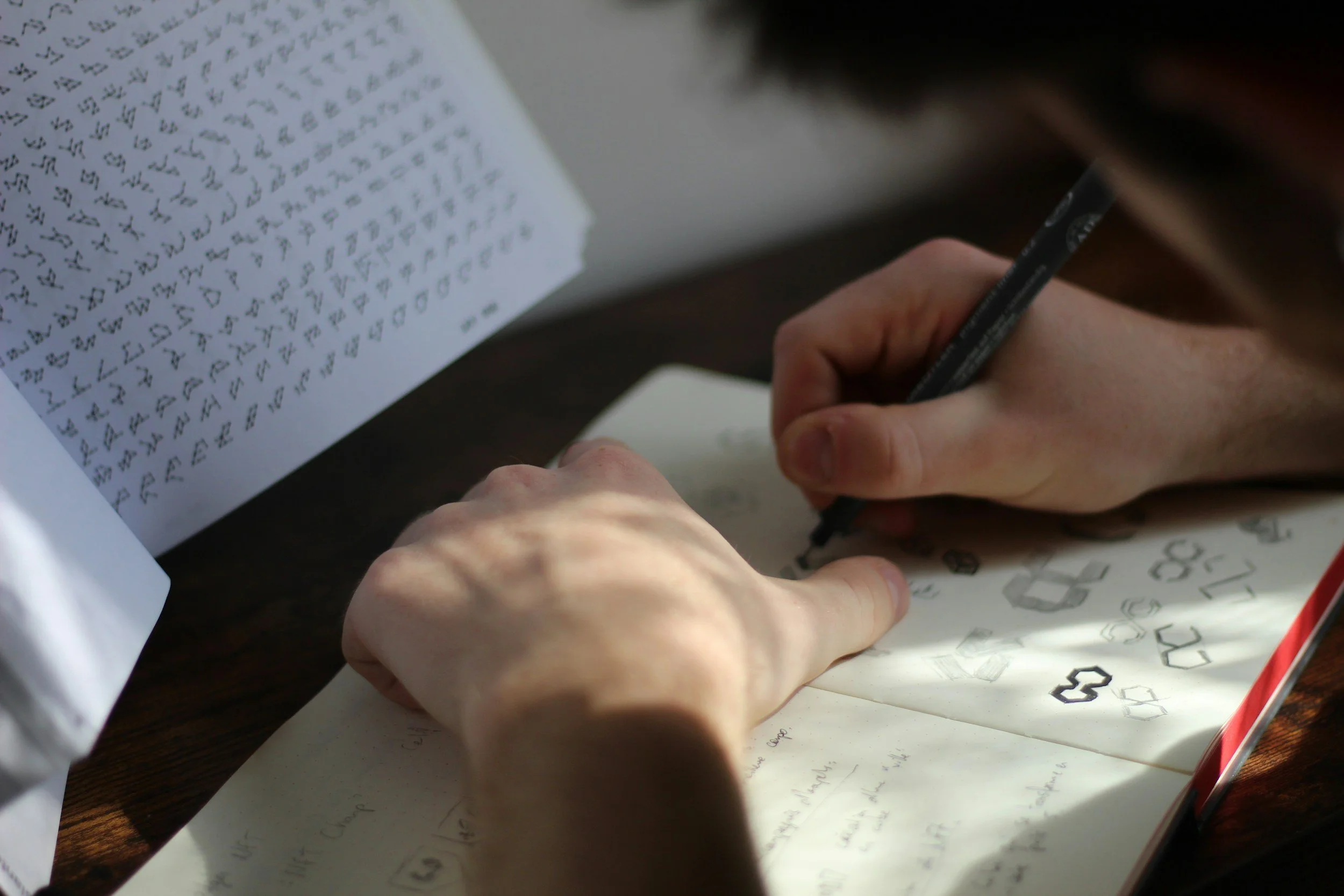
A few weeks ago (for April Fool’s Day) we rebranded Bara Studio using ChatGPT.
I fed it our brand strategy, gave it a few pointers on logo design, and let it loose.
The results were, objectively, terrible. Which made for a great video.
But here’s what I didn't say out loud at the time: it wasn’t entirely wrong. It processed the brief. It found themes. It generated ideas in seconds. The output wasn’t there yet - but the process was faster than I’d like to admit.
That tension between laughing at the output and taking the capability seriously, is pretty much where I've been living for the past year! And I think it’s where a lot of designers and charity leaders are too. So let me try to untangle it.
The Bara Studio ‘rebrand’ using AI tools on April Fool’s Day
Every tool revolution has been a moral panic
When the first branders and sign-makers started using mechanical tools to produce identities, people said it took “the soul” out of the work.
When Adobe Illustrator launched, designers insisted that drawing by hand was the only honest way. Now Illustrator is the industry standard, and nobody remembers the controversy!
This seems to be the pattern with how tools work. First, they get accused of killing the craft. Then they become inseparable from the craft.
AI is a new chapter in that story. It's not a different story.
The good, the bad and the complicated
AI is super impressive at the early stages of logo design. It can process a brand strategy workshop write up, spot patterns in research, and generate a pile of visual concepts at a speed that no human designer can match.
That’s not insignificant. Pattern recognition and idea generation at pace are really useful skills and it changes what the design process looks like.
However one area where it currently struggles is the SMART test, a framework popularised by Ian Paget at Logo Geek: Simple, Memorable, Appropriate, Resizable, Timeless. This rigorous test is a sort of filter system which helps designers to critique concepts, with only the very best remaining. This act of minimalising (not sure if that’s a word), reducing and stripping away is something which doesn’t come naturally, but we must do it.
As Paul Rand, one of the great identity designers of our time, put it:
“a design that is complex, fussy, or obscure harbors a self-destructive mechanism.”
But assuming any reasonable rate of improvement over the next two to five years, I’m fairly confident that gap will close. So let’s talk about what happens when it does.
The levels of design
There's a distinction I make with clients and students that I think is useful here. I call it the difference between naive design and expert design.
Naive design can look impressive at first glance. It's packed with meaning, layered with symbolism, busy with ideas. It says: look how much thought went into this. And on one level, that’s genuinely hard to do. But that doesn’t make it right.
Expert design does something harder. It takes all of that complexity (the strategy, the research, the fifty ideas on the sketchpad) and distils it down to one clear, simple, unmistakable symbol.
Behind every great minimalist design is a process of subtraction so deliberate it borders on obsessive - a designer asking, again and again, does this element earn its place?
The Nike Swoosh. The arrow hidden in the FedEx logo. The Apple silhouette. None of these are technically difficult to reproduce once you’ve got them. The difficulty was getting there in the first place - and knowing, when you did, that you were done.
What I haven’t yet seen from AI is the ability to do that editorial work. To look at a hundred generated concepts and say: this one. Not because it’s the most complex, but because it’s right for the charity, church or purposeful organisation.
More options is not the win you think it is
Here’s a counterintuitive problem with AI-powered logo generation: it gives you everything, which means it gives you nothing.
Psychologist Barry Schwartz explored this in The Paradox of Choice (2004). The more options we have, the less satisfied we feel with our final decision - because having too many choices requires more cognitive effort, leads to decision fatigue, and increases the regret we feel afterwards.
A charity that uses an AI tool to generate five hundred logo options is not better positioned than one that works with a designer to develop five considered ones. It’s actually in a worse position. The paralysis is real. The regret is real. And without someone in the room with taste and training to say “this one, and here’s why” the process collapses into committee.
This is actually where AI exposes something important about what designers are really for.
It’s not the drawing. It’s the deciding.
What won’t change
The things that will keep human designers relevant aren’t mystical. They're quite specific.
Track record. People trust individuals who have done this before and can show what happened. An AI tool cannot demonstrate proof of concept in the same way. It cannot be held accountable for the result.
Taste.The ability to hold strategy, audience, design history, and a felt sense of what is appropriate simultaneously, and to have the conviction to act on it. This is not something that currently emerges from the models out there which are currently trained to affirm your instincts rather than challenge them.
Relationship. Charities aren’t just buying a logo. They’re navigating something significant: a decision that will represent them for years, probably made by a board or a team with competing views. Having a person in the room, someone who has done this before, who knows when to push back, who can hold the space when the committee can't agree, is irreplaceable.
There’s also something worth saying about homogeneity (or sameness). When millions of organisations are drawing from a small handful of AI models, the outputs start to look like each other. (We’ve seen this with the proliferation of the em dash in copywriting. Looking at you, ChatGPT!)
The value of a genuinely distinctive identity (one that clearly wasn’t generated, but instead has the fingerprints and even the imperfections of a specific creative mind on it) is likely to go up, not down.
Concluding Thoughts
That ChatGPT rebrand video was funny because the output was bad. And it’s still bad. Really, really bad. But I’d be doing you a disservice if I pretended it was going to stay that way.
What I’m more confident in is this: the role of the creative director isn’t going anywhere. It’s changing shape. Charities will get the most out of these creative processes when they understand what AI is good for (speed, ideation, pattern recognition) and use it accordingly, while holding firmly to the part of the process that requires a human being: The strategic clarity. The editorial conviction. The honest conversation with a client when their favourite option isn't the right one.
AI is a very fast, very capable intern. Experienced creative directors are still very much in charge and worth their weight in gold.
So if you're a charity wondering whether you should hand your visual identity over to an AI model? You need to ask yourself this question: how important is it that you get this right? What’s the potential return on investment from a successful brand project?
We’d always recommend the important decisions are made by people, for people.
Sources
SMART framework - Ian Paget, Logo Geek: logogeek.uk/logo-design/smart-principles
Paul Rand from Design, Form and Chaos (1993)
The Paradox of Choice - Barry Schwartz (2004)