BeSpace
Helping young people thrive - by learning stillness
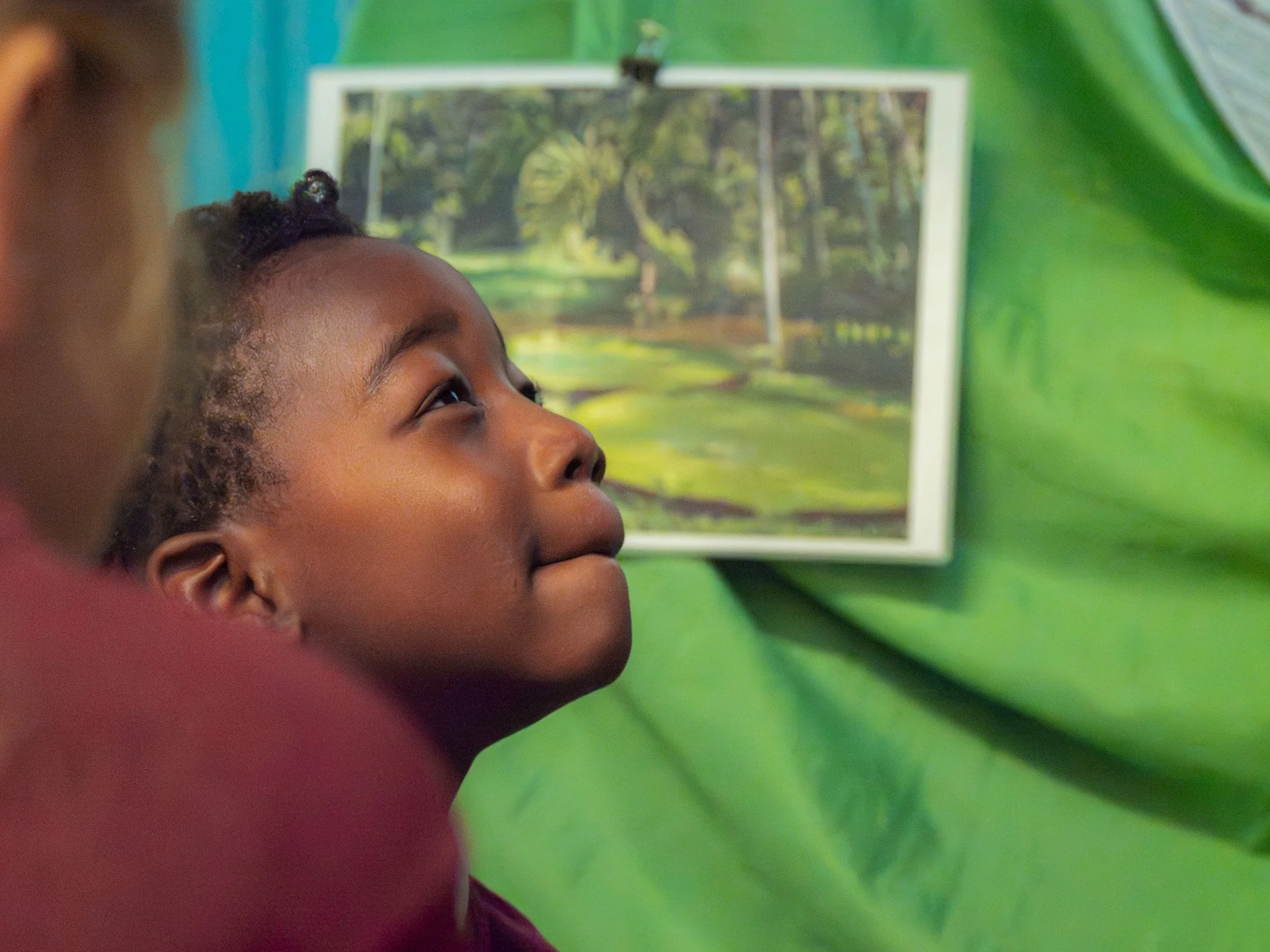
BeSpace creates peaceful, meditative spaces within schools, giving children and young people room to pause, breathe and find calm in the middle of a busy day. It’s quiet, meaningful work. The trouble was, their brand wasn't saying any of that.
The Challenge
BeSpace knew their charity was doing something special. Their website didn't agree.
They found themselves struggling to put their mission into words, and their online presence had started to hold them back rather than help them move forward. Funding applications felt like an uphill climb, recruitment felt like a hard sell, and there was a nagging sense of embarrassment every time someone asked “can I see your website?”
They needed more than an update. They needed clarity on who they were, confidence in how they said it, and a website they’d be proud to point people towards.
BeSpace took part in our Charity Brand Accelerator, here’s what happened.
The Process
1 Strategy
Every great brand starts with a conversation, so that’s where we began. Through a series of strategic workshops (utlising the Lego® Serious Play® Method) we dug into the BeSpace mission, vision and purpose, along with their personality and what made them different from anyone else in the space.
“From the beginning, the process felt familiar, making it easy to get stuck in straight away. It was enjoyable to work in different ways, like using Lego® and full-day interactive workshops.” - Harriet, Operations
The result was a strong Charity Brand Strategy and a messaging pack that finally gave BeSpace the words they’d been searching for. This was the foundation for everything that followed.
2 Visual Identity
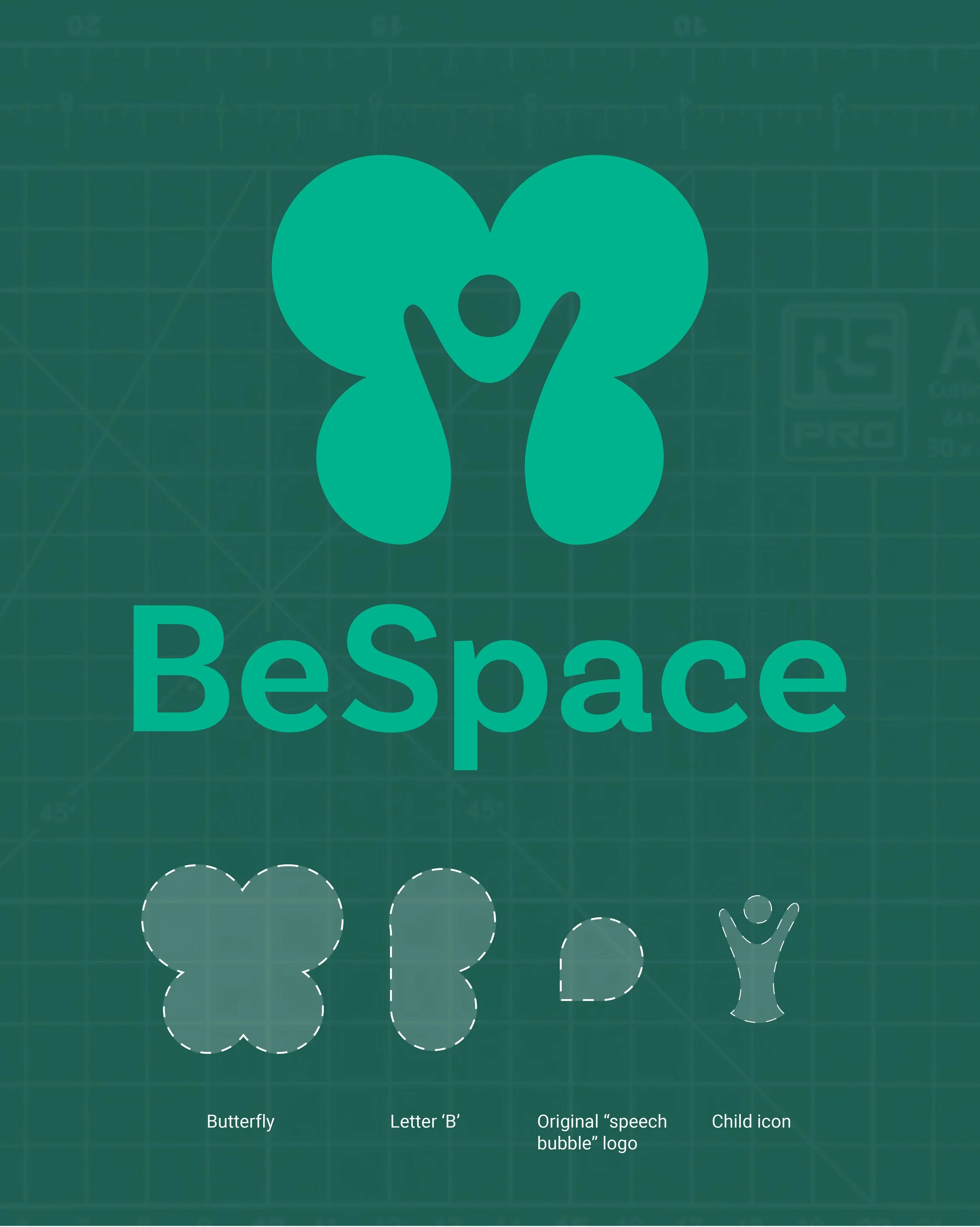
With the strategy in place, it was time to bring BeSpace to life visually. During a brand nouns exercise, one idea rose above the rest: the butterfly. A perfect fit, not just for its transformation, but for the stillness that has to come first. Fitting, really, for a charity built entirely around the power of pause.
From there, our creative team set to work shaping a visual identity that felt just as calm and considered as the spaces BeSpace creates.
3 Assets
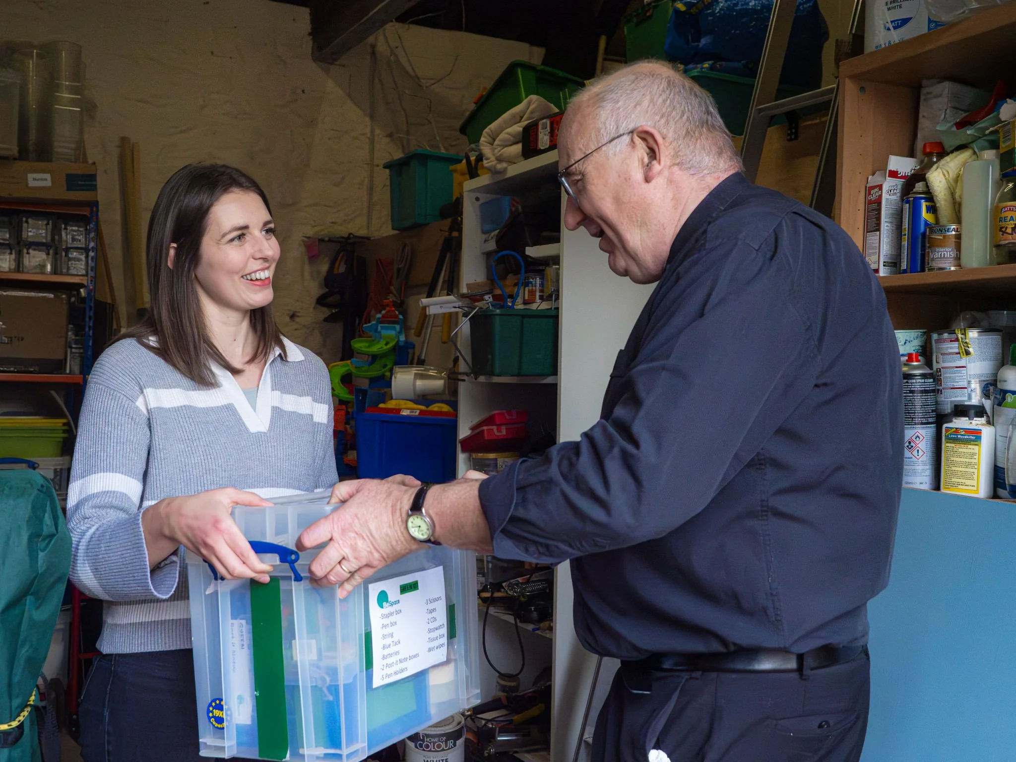
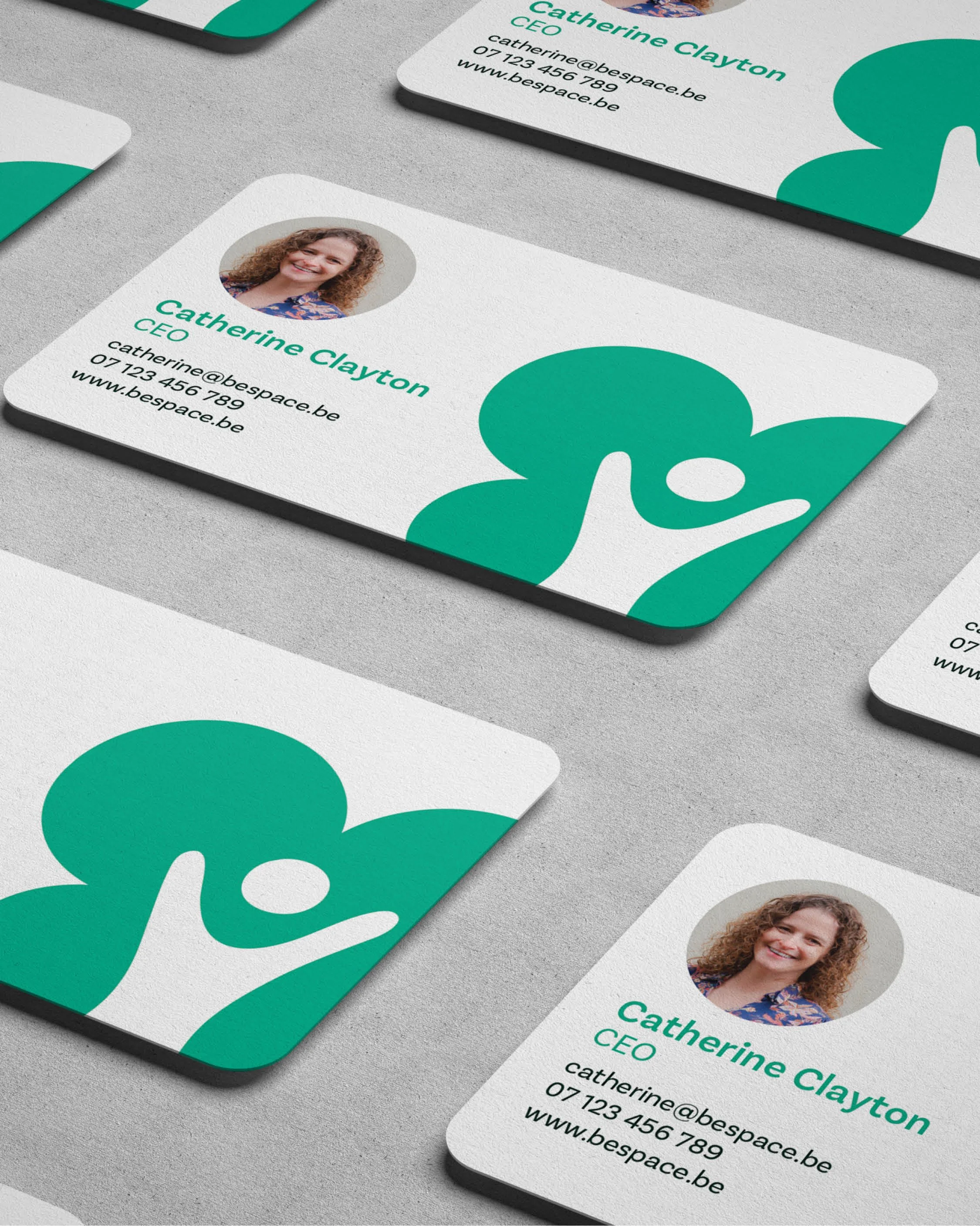
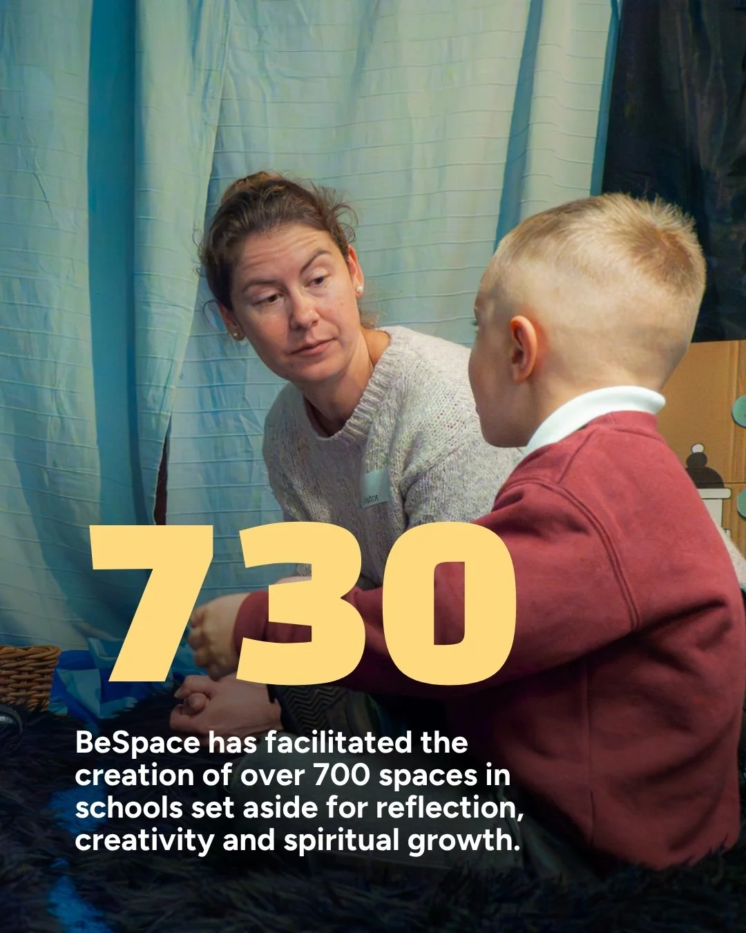
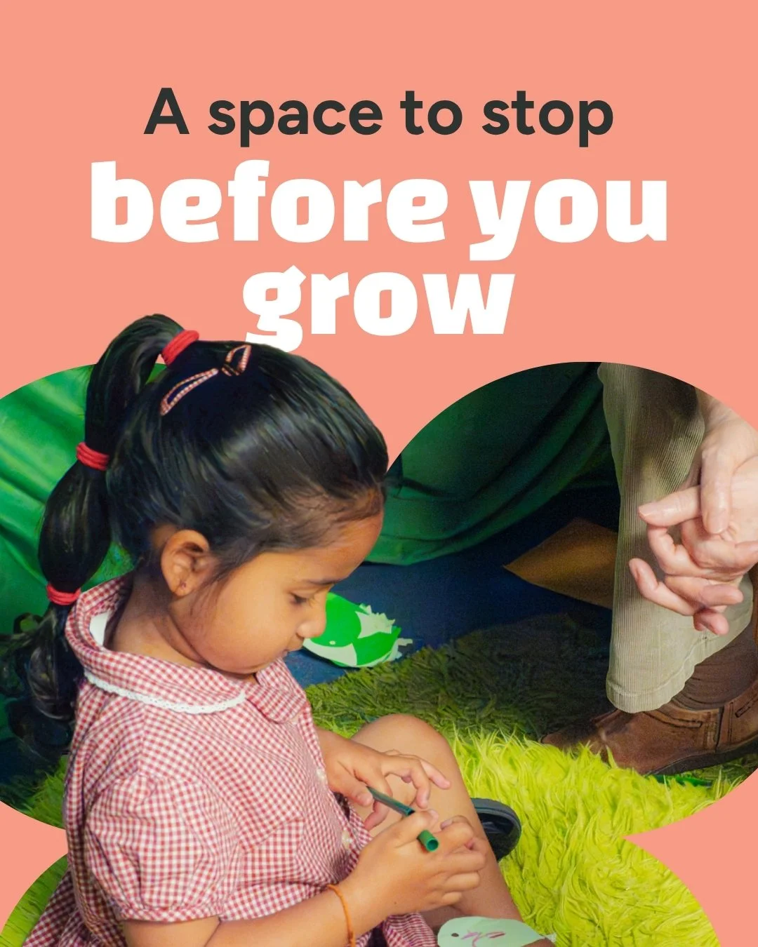
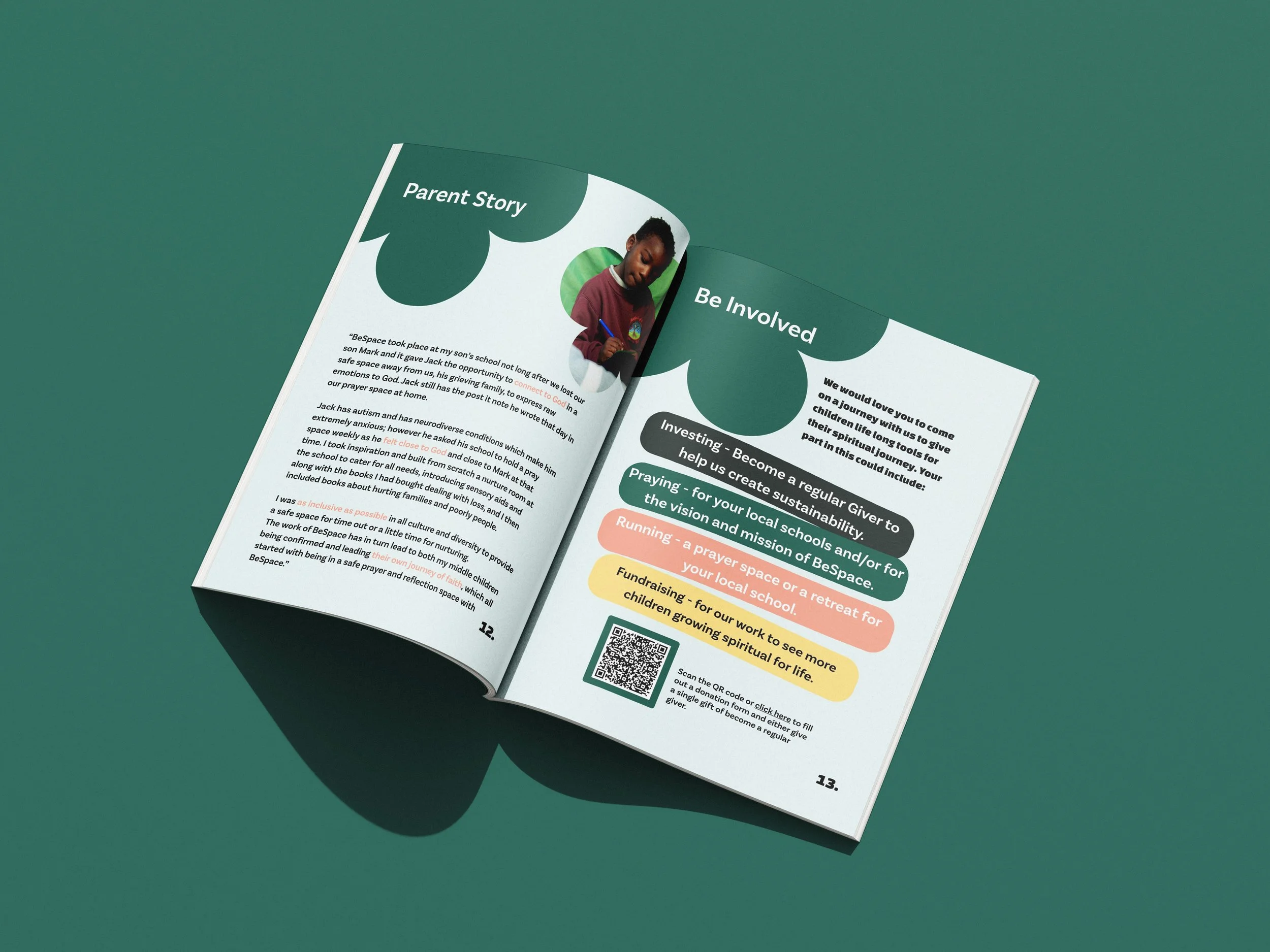
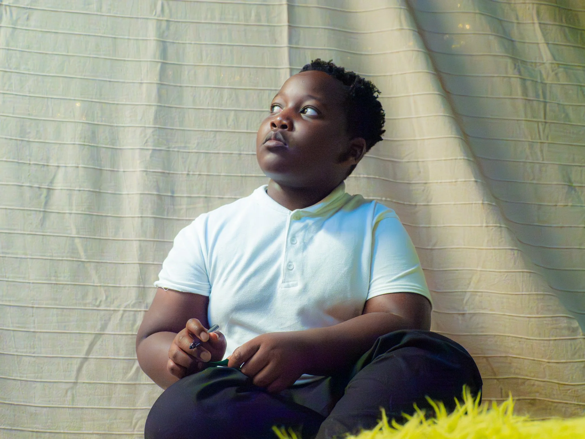
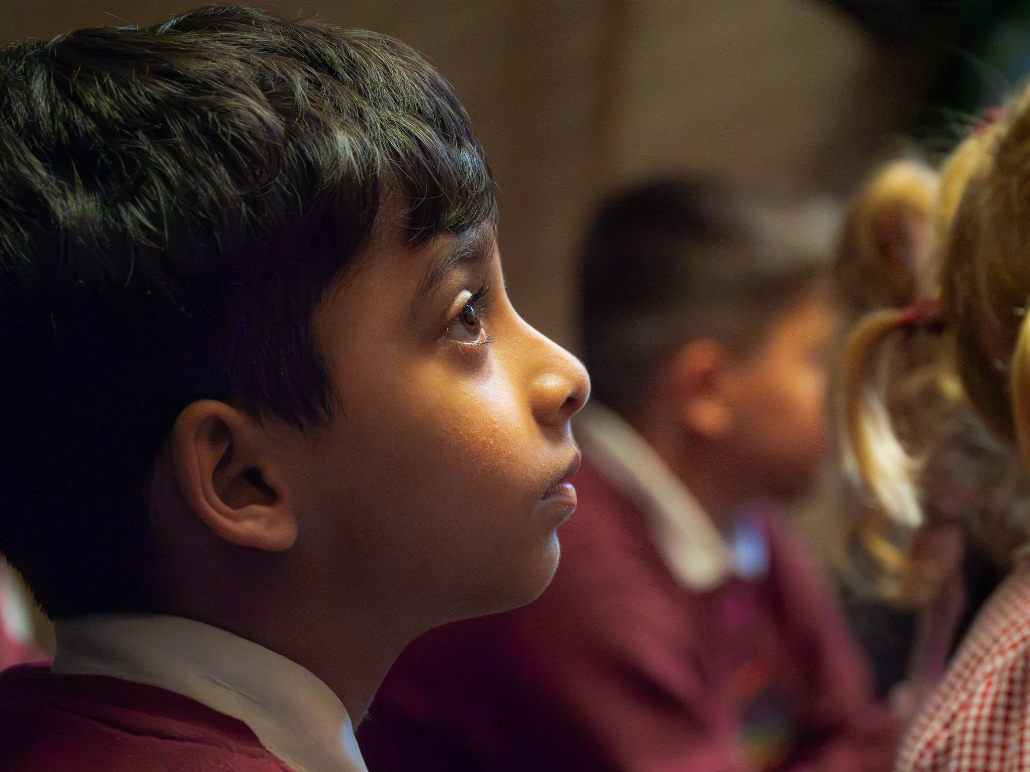
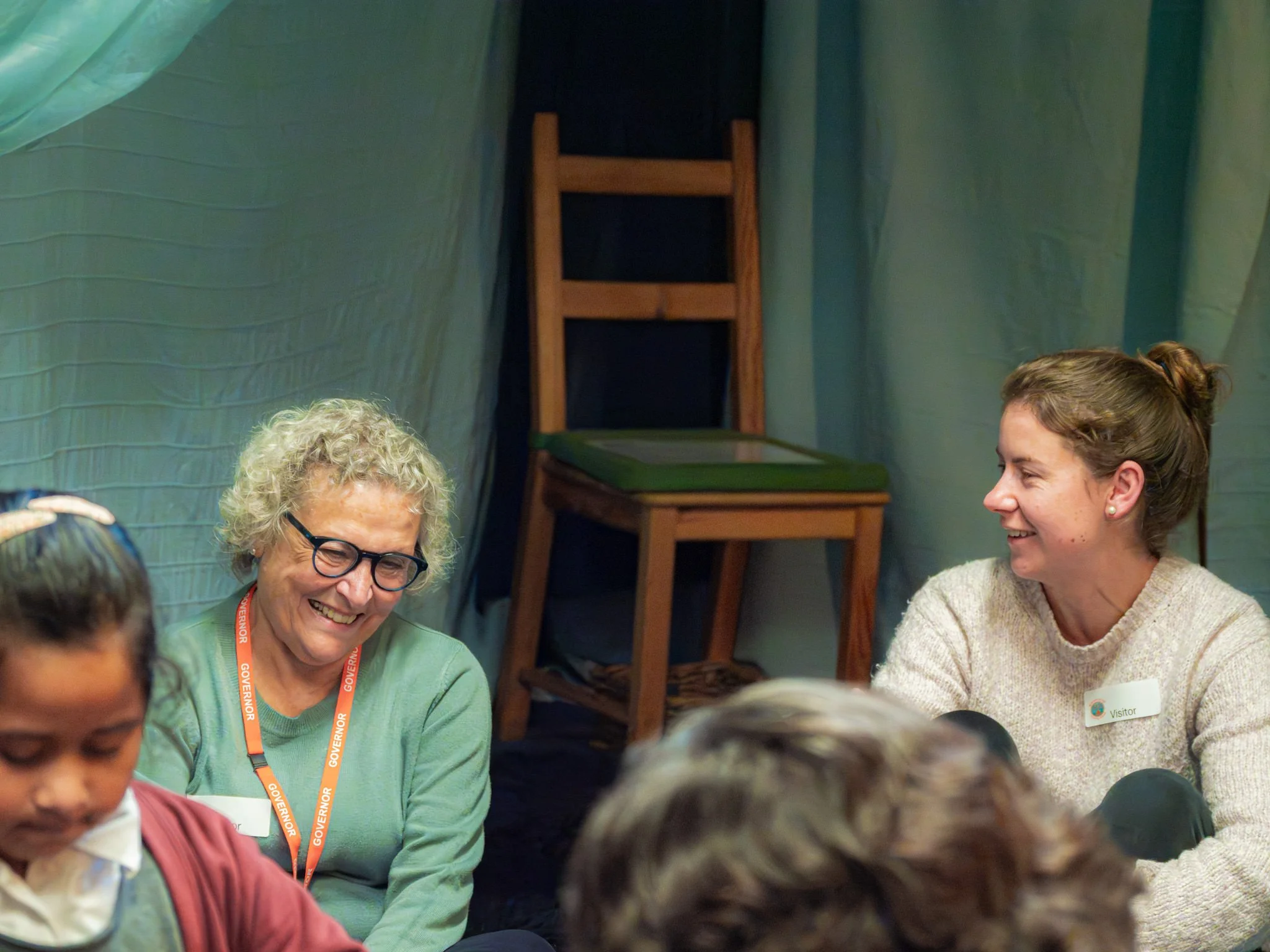
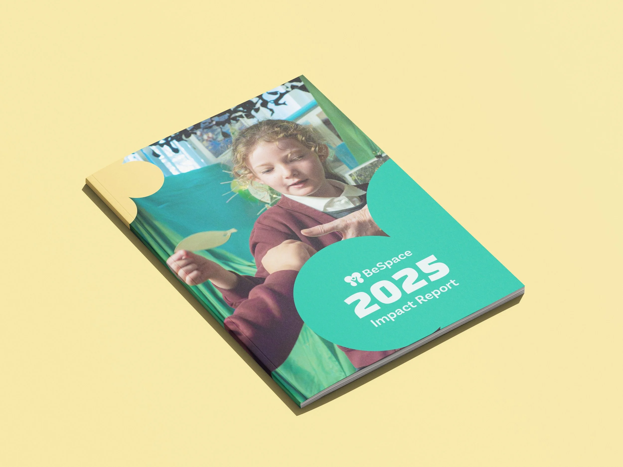
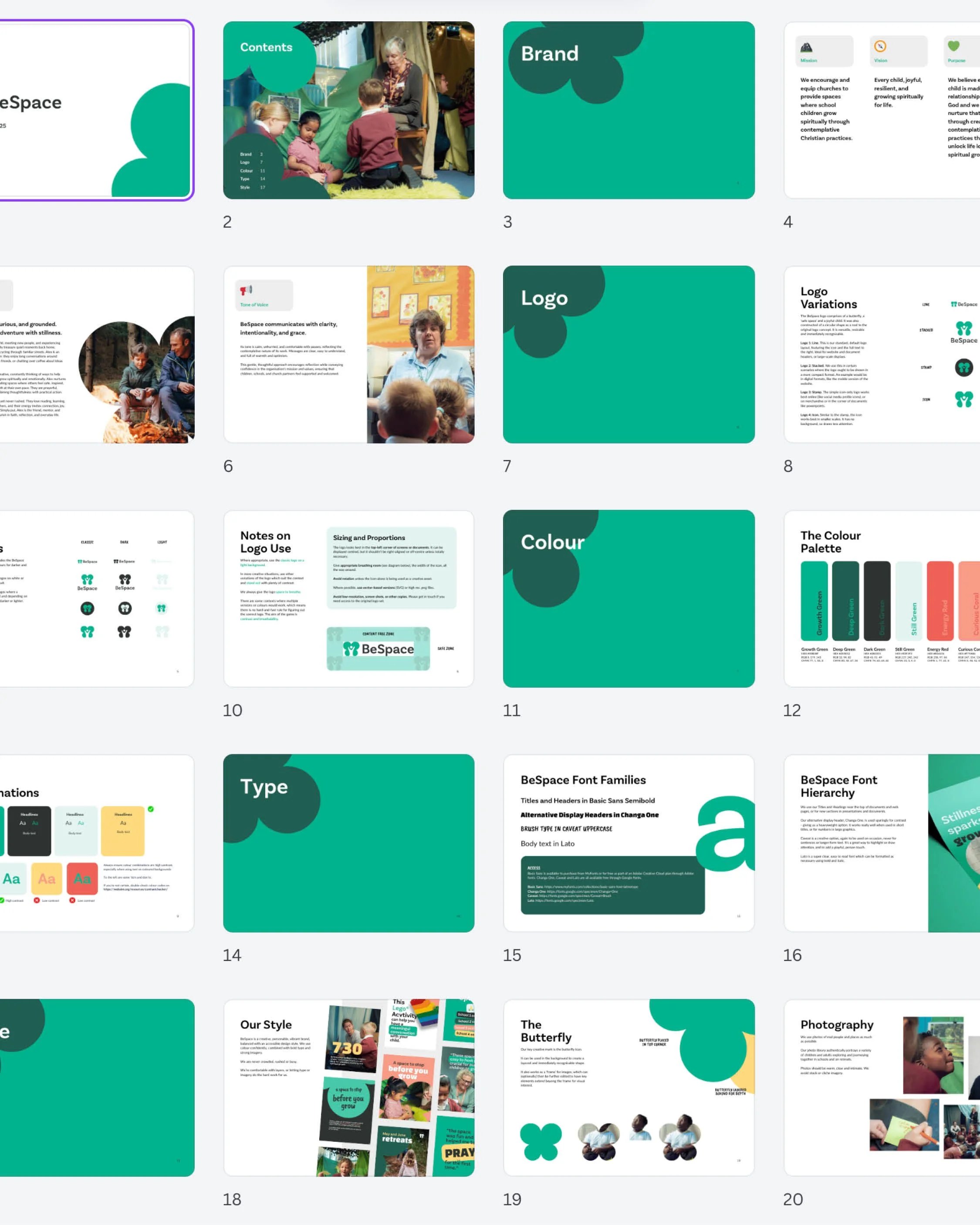
A strong brand needs more than a logo, so we booked in professional photography to capture the real magic of BeSpace in action: volunteers guiding children through peaceful, meditative moments, right in the middle of the school day. Alongside this, we built a suite of Canva templates, giving the team an easy way to keep their presentations, social media and stationery looking consistently brilliant.
4 Website
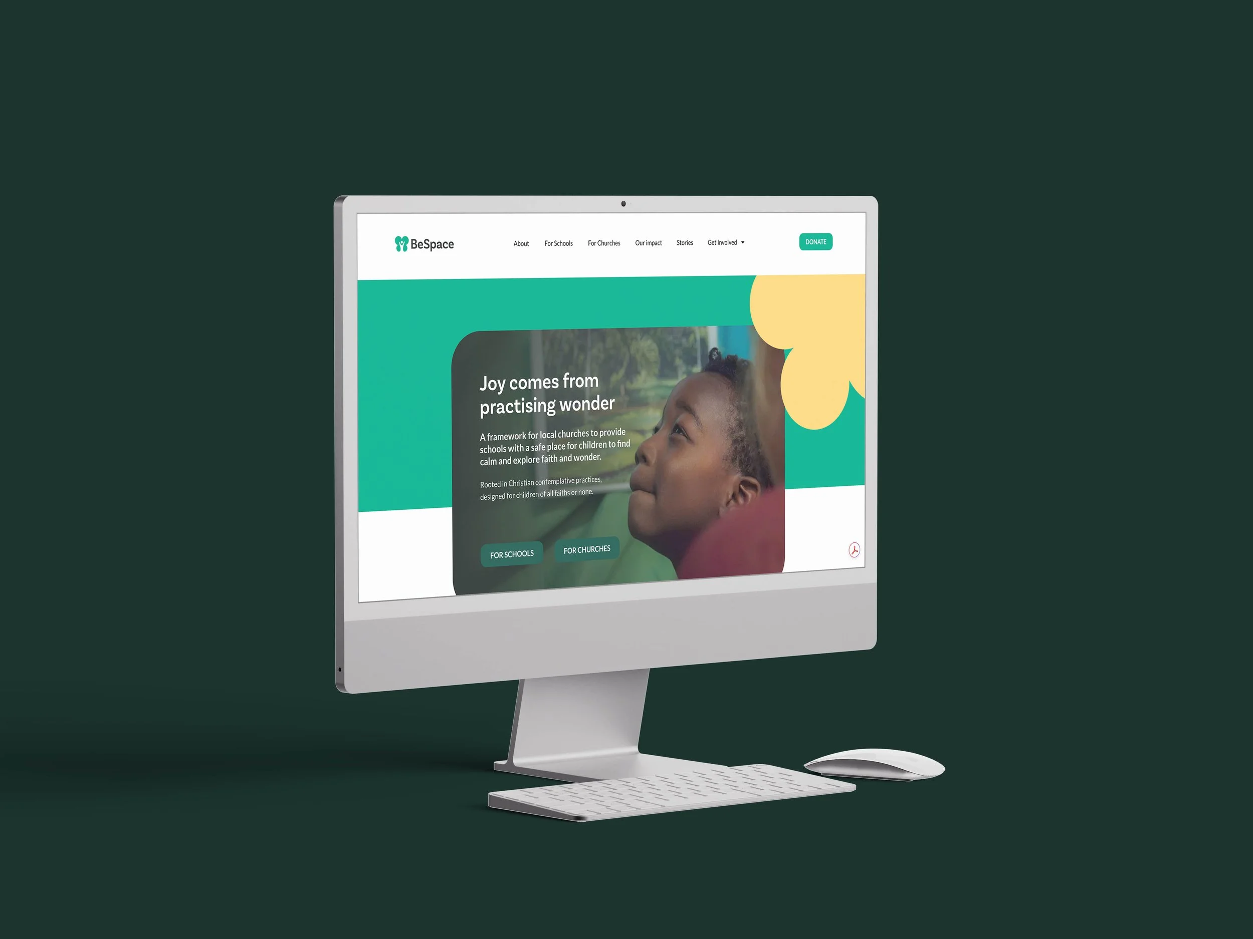
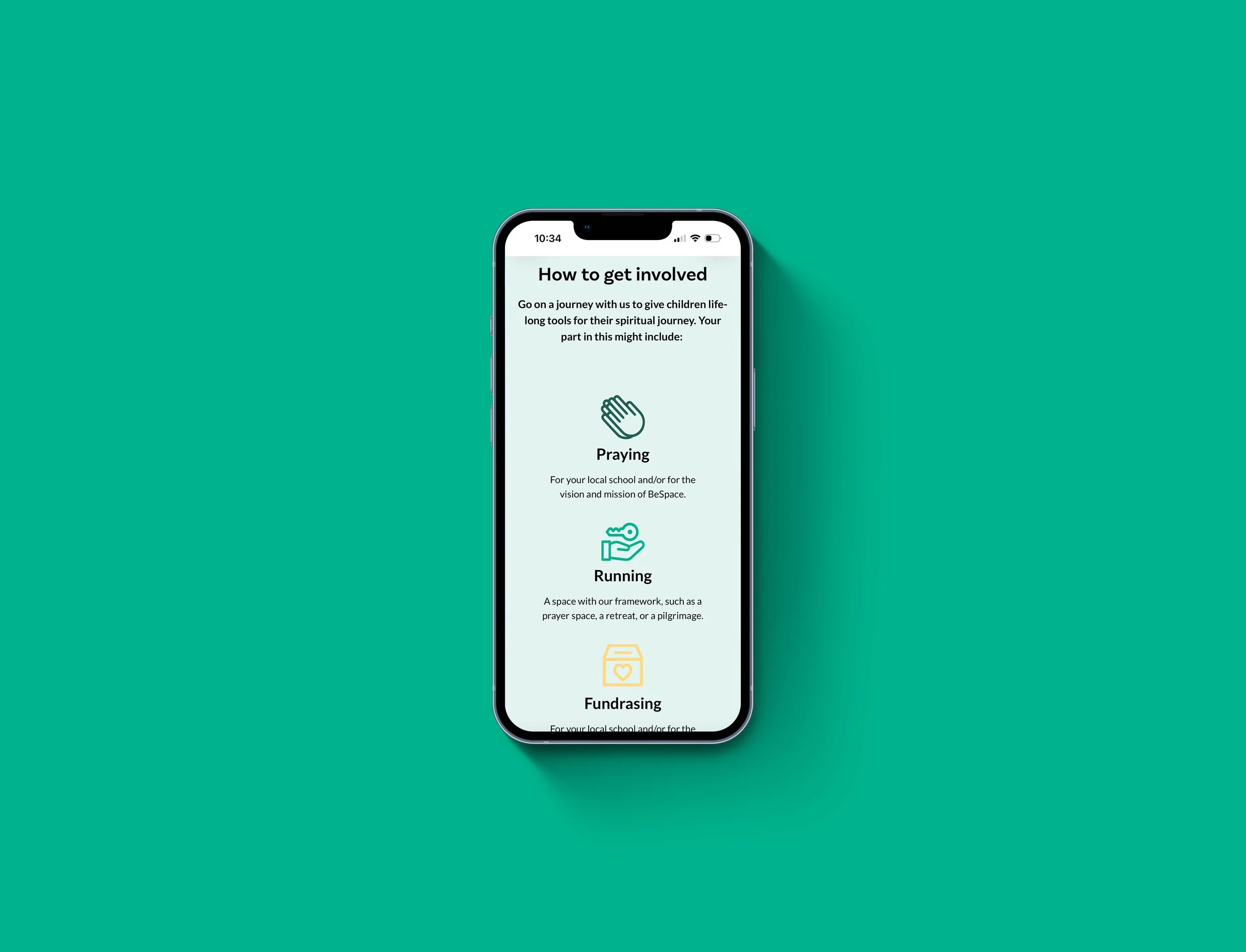
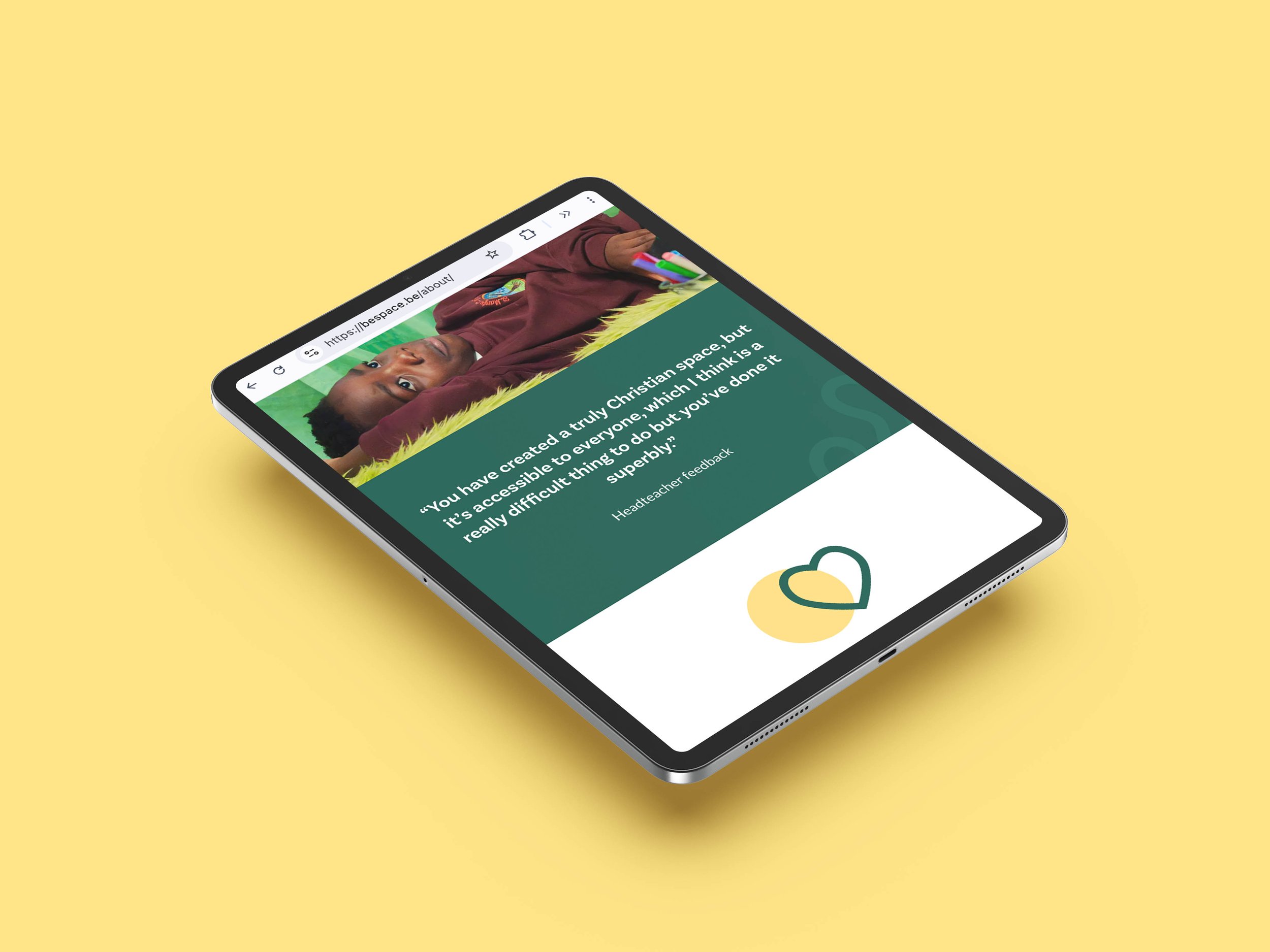
With strategy, visual identity and photography all working in harmony, we brought it all together in a new website. One that finally reflected the heart of BeSpace, rather than hiding it.

The Result
BeSpace now has what we like to call the three C’s: Clarity, Confidence and Consistency.
They know who they are, they know how to say it, and they’re no longer wincing when someone asks for their website link.
That’s the bit we love most. Not just the logo, or the website, but the sense of partnership along the way.
If your charity is doing brilliant work but struggling to say so, we’d love to help you find your words too.
“Working with the Bara team was easy, warm and encouraging. No question felt too big or too small, and the wider team’s genuine excitement made us feel like they were part of the BeSpace team.”
Catherine Clayton, CEO