Bristol Baptist College
300 years of heritage meets a brand built for today
Bristol Baptist College has been training people for ministry for over 300 years. But somewhere along the way, their visual identity stopped keeping pace with the warmth and excellence happening inside their community.
The Challenge
The brand was doing the college a disservice. Staff and stakeholders described it as dated, even “stodgy,” with a logo that felt more like a corporate leftover than a reflection of a living, breathing community.
A cold blue and grey palette added to the problem, giving little sense of the warmth that visitors and students actually experience.
-
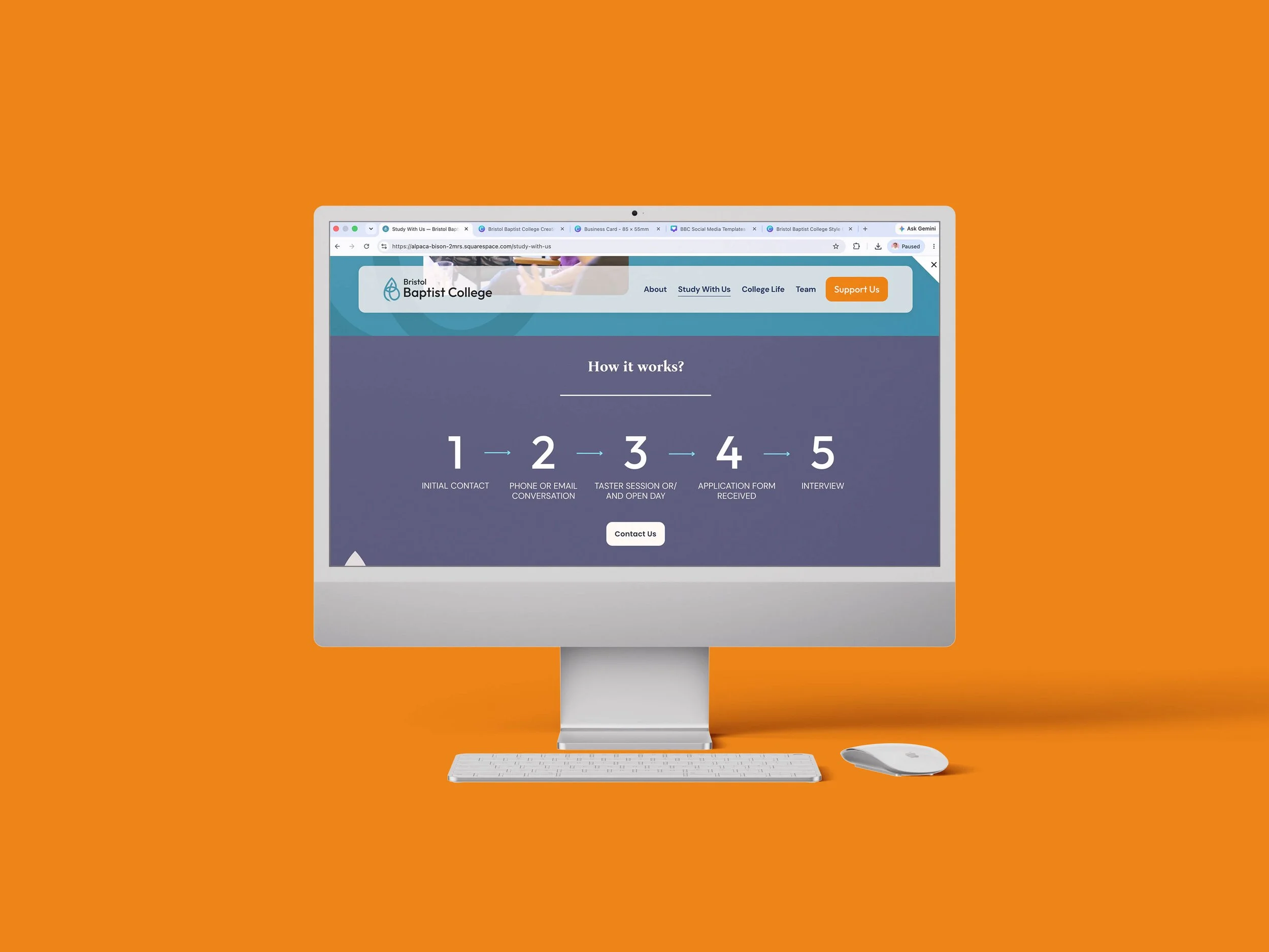
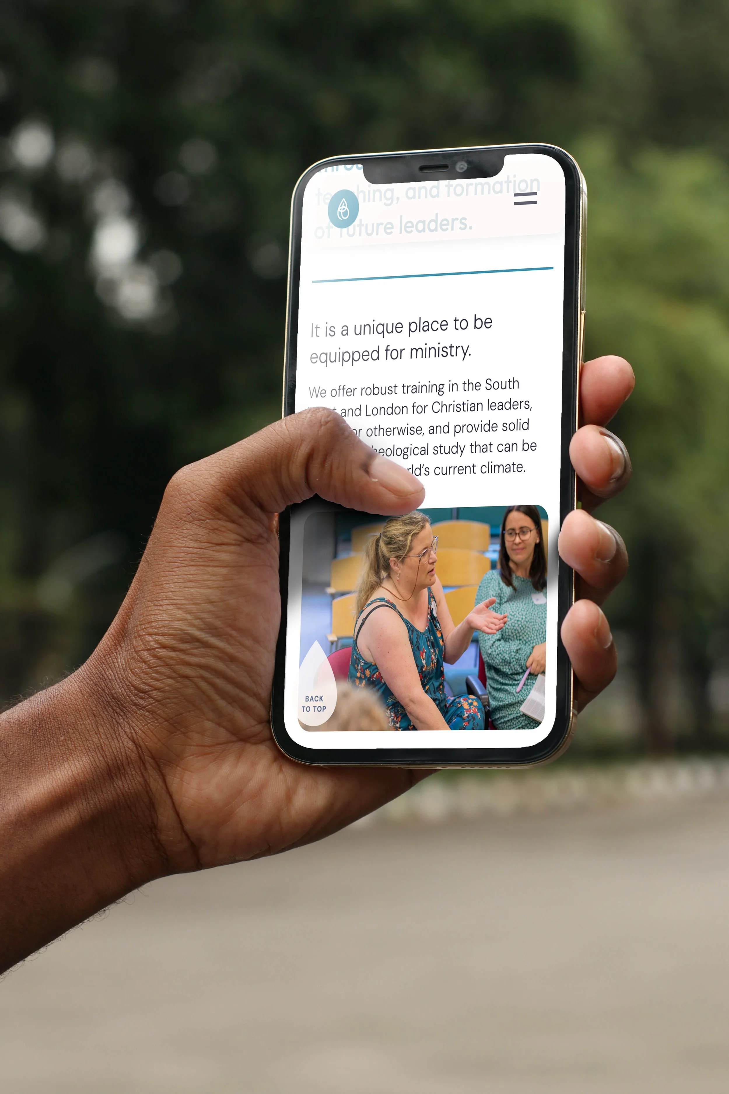
The website wasn’t helping either. It was clunky, hard to navigate on mobile, and struggled to explain the flexibility of the college’s training model, including its regional hubs and block week structure.
All of this fed into a bigger challenge: recruitment. Competing against larger, better-known residential institutions is tough at the best of times, and the college had settled into a “small fry” perception that didn't match the quality of what was happening in the classroom.
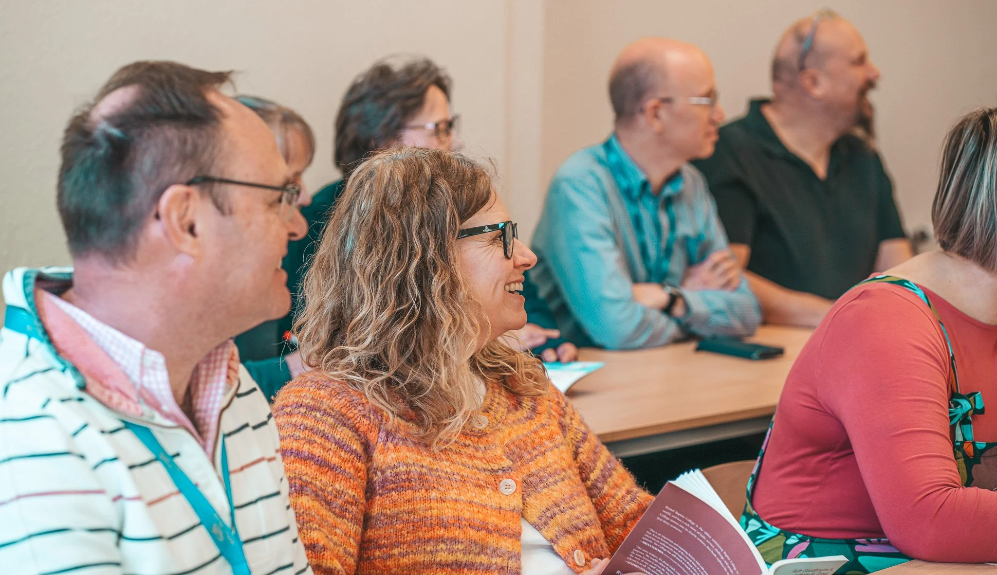
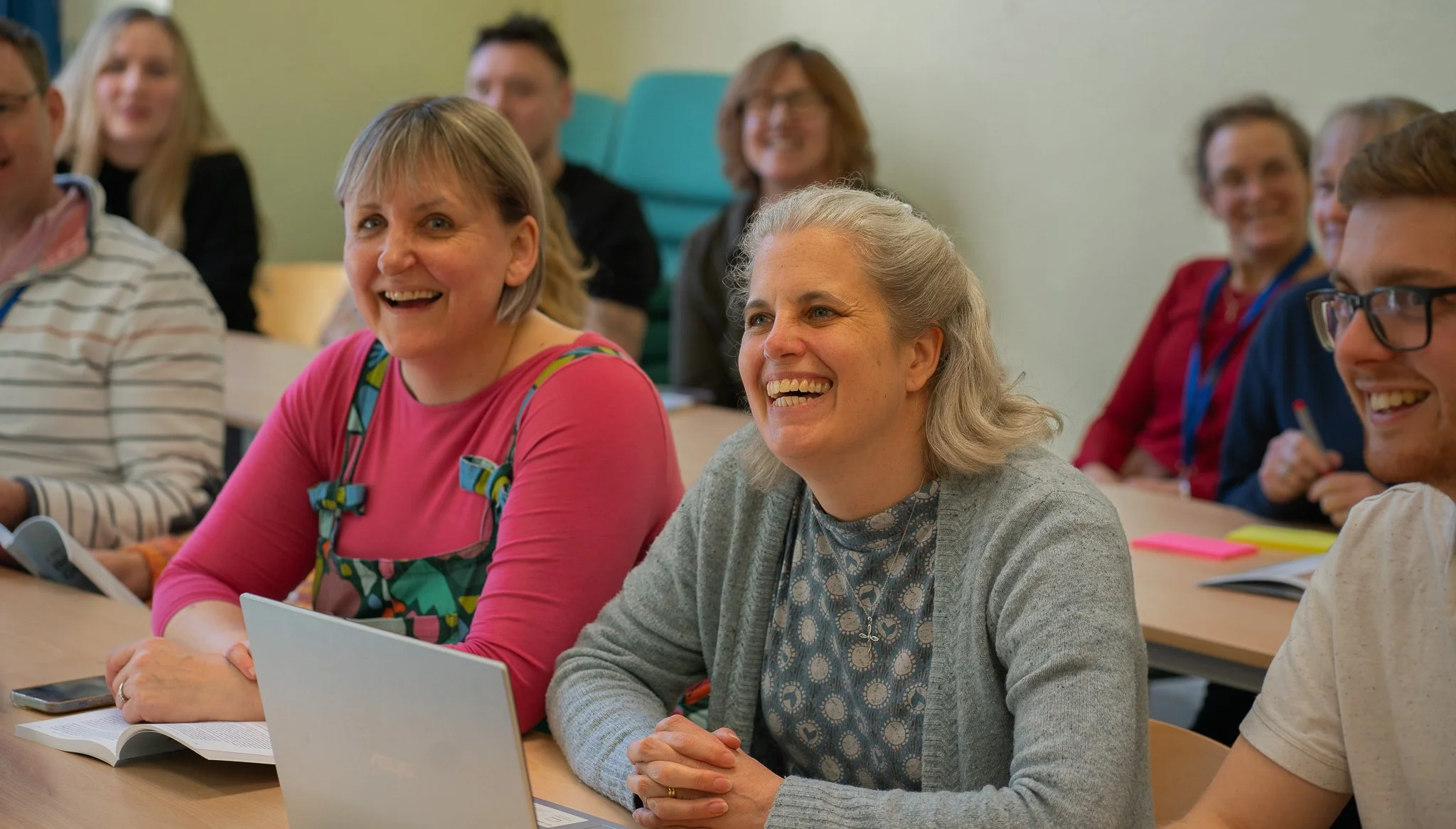
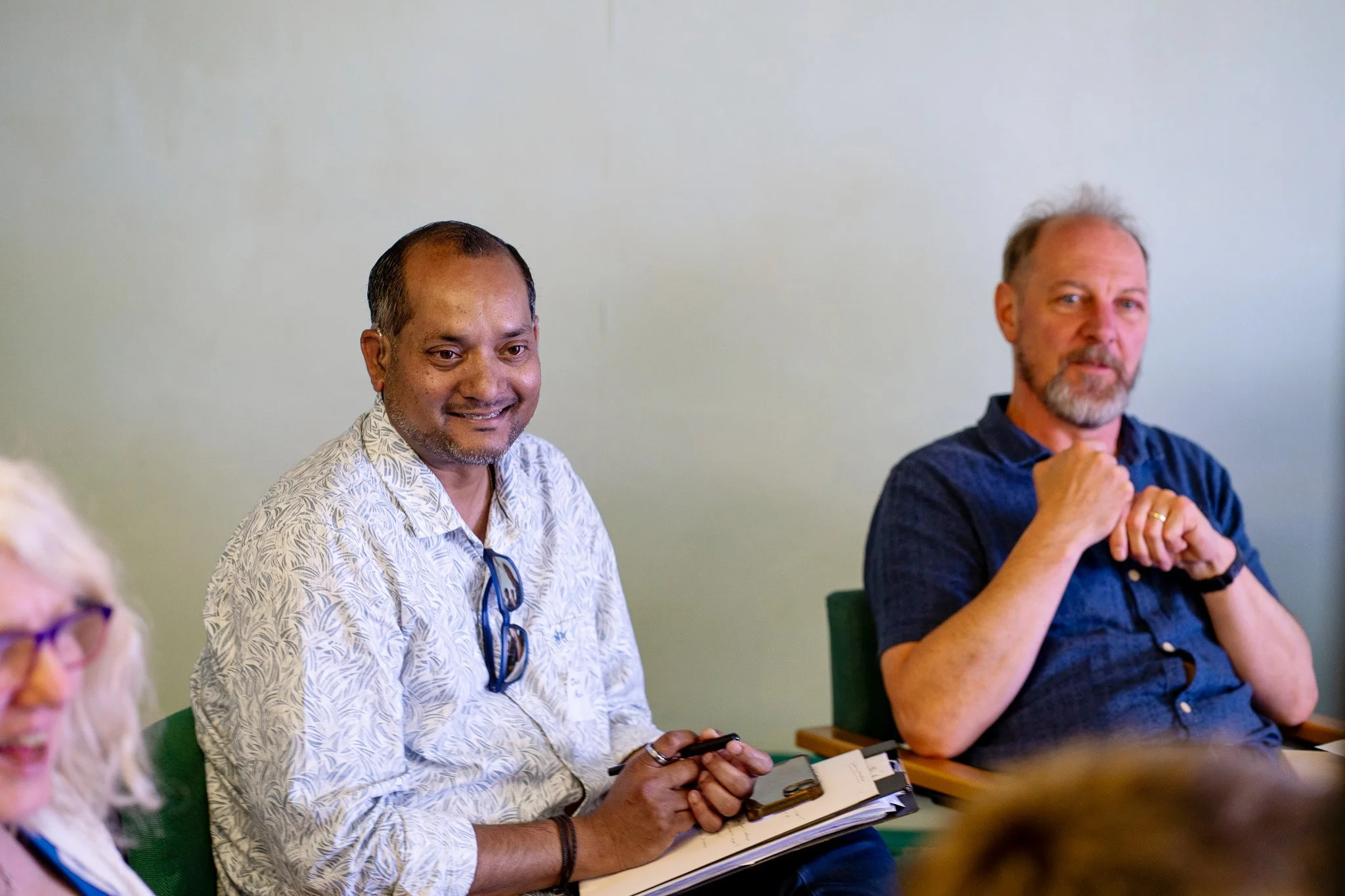
Their marketing materials leant heavily on photos of buildings, when their real strength was always the people.
Bristol Baptist College invested in our Charity Brand Accelerator and a website service too. Find out more below.
The Process
1 Strategy
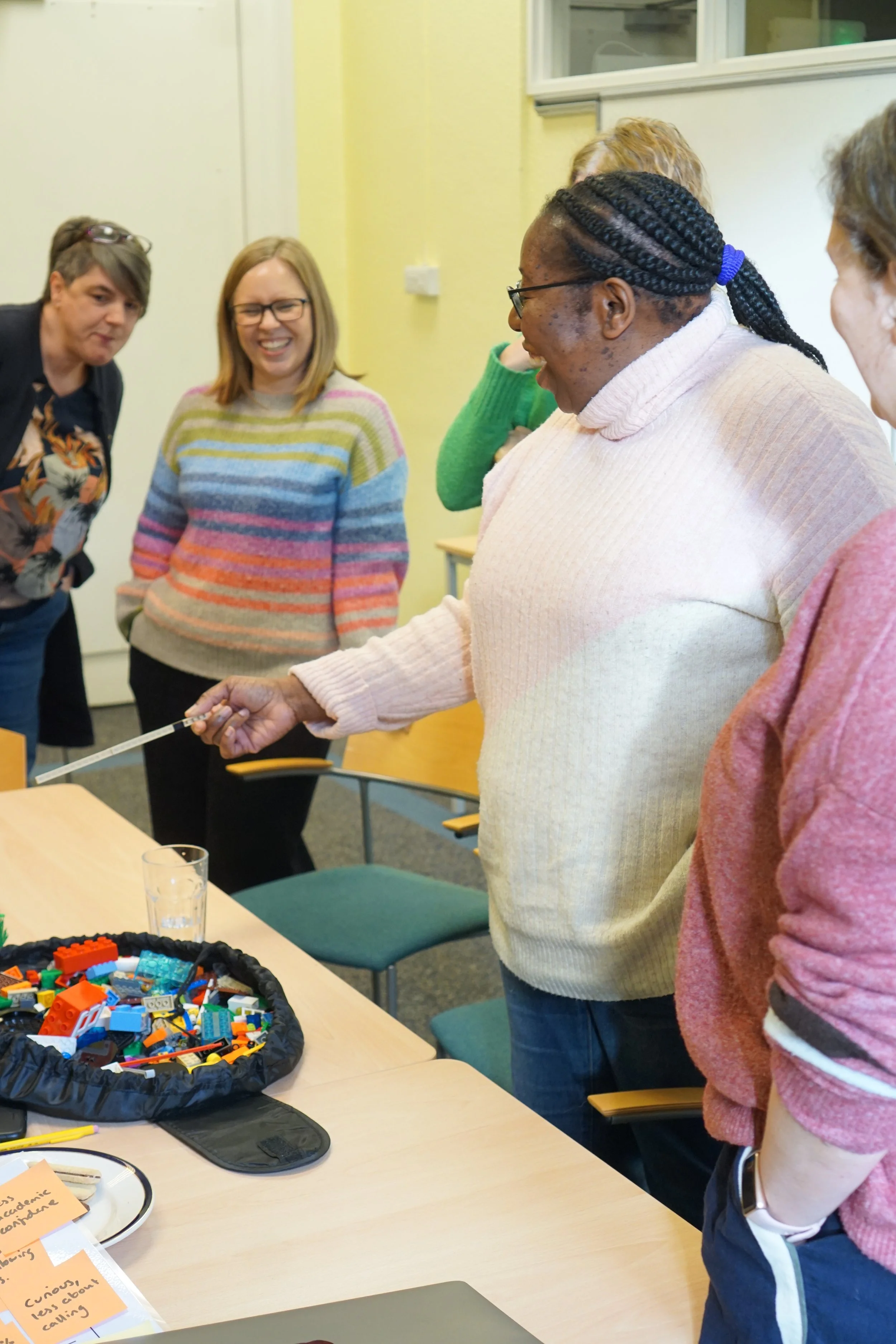
We began with two in-person brand strategy workshops using the Lego Serious Play method, digging into brand personality, target audience and positioning.
This was backed up by thorough research, including stakeholder interviews and a wider audience survey, giving us a rich, well-rounded picture of the college from every angle.
2 Visual Identity
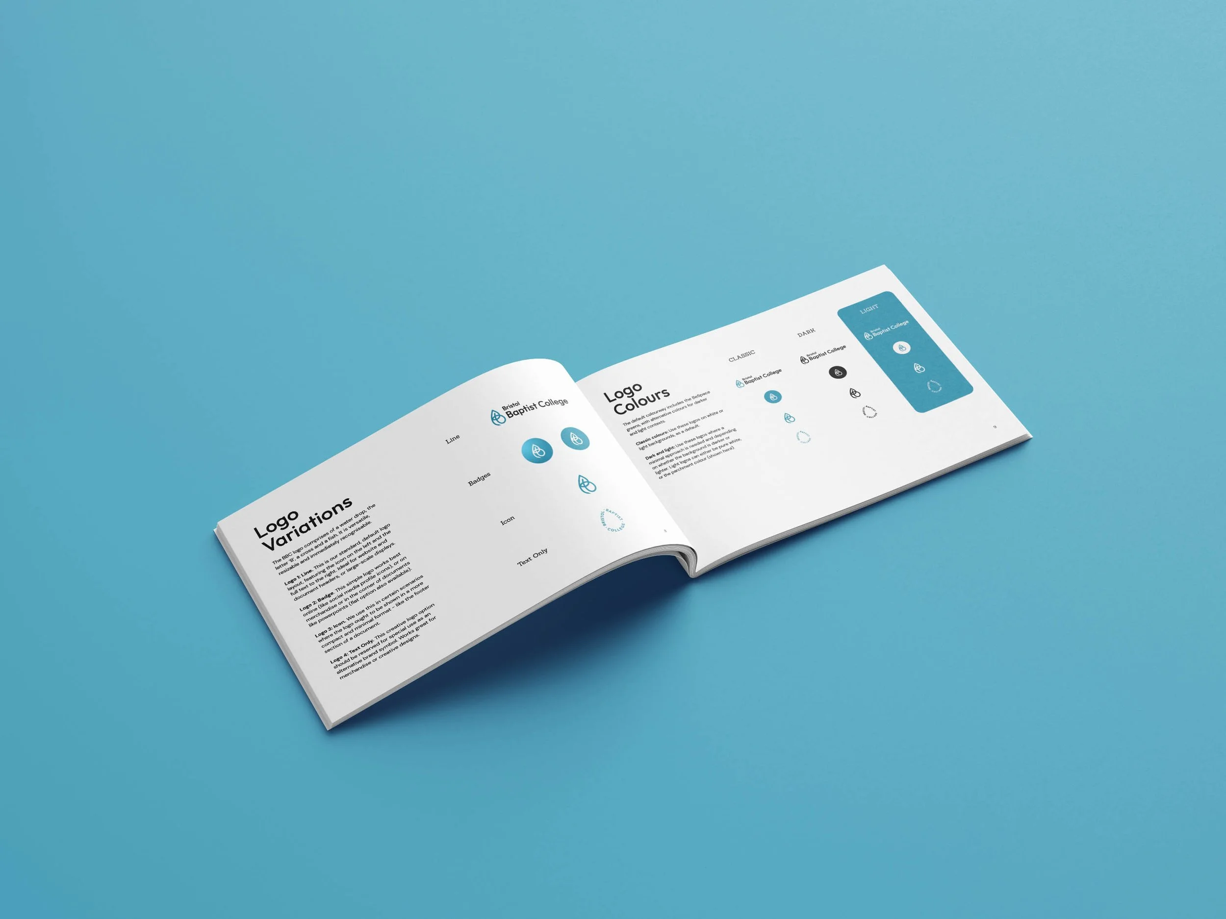
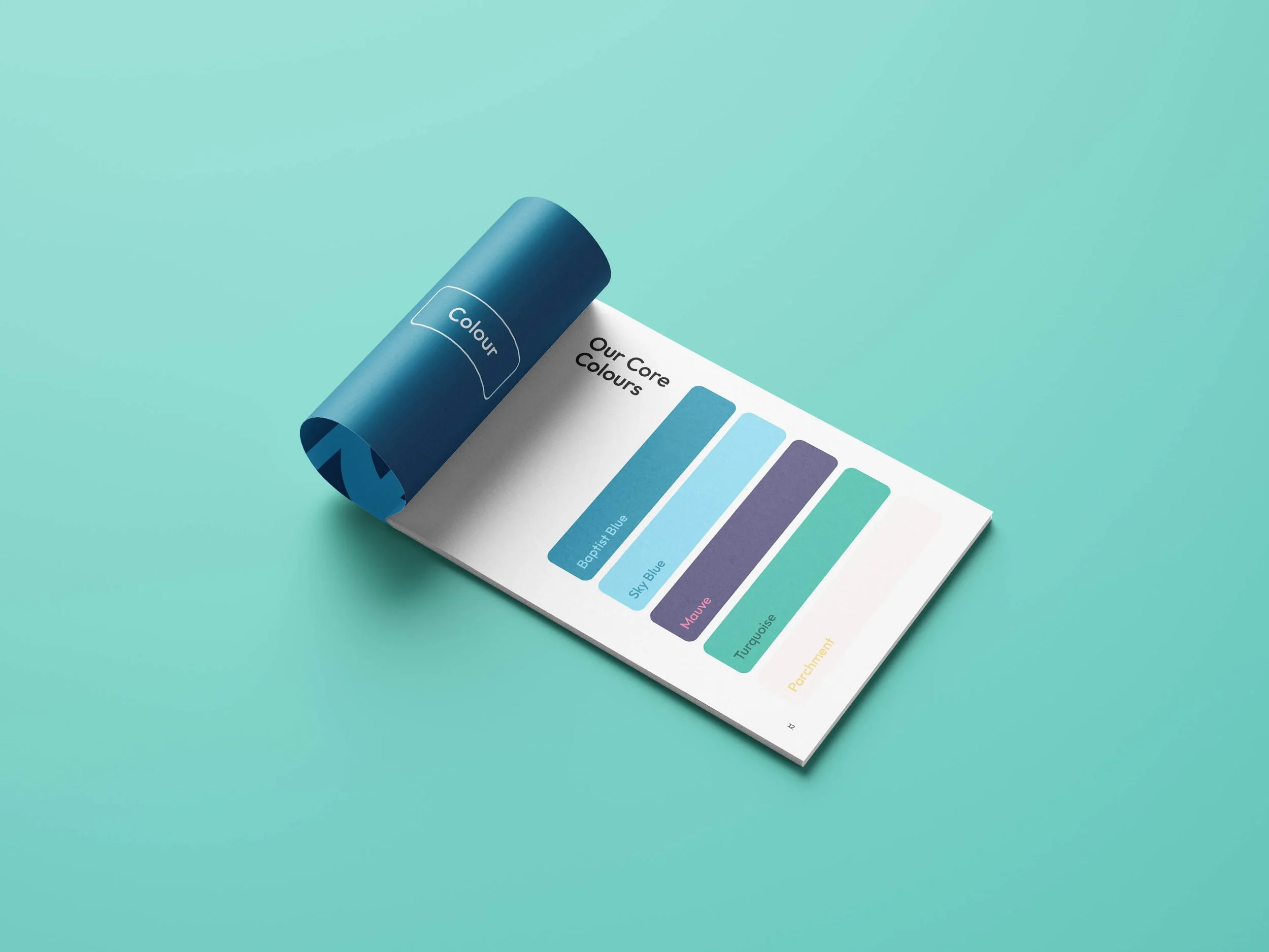
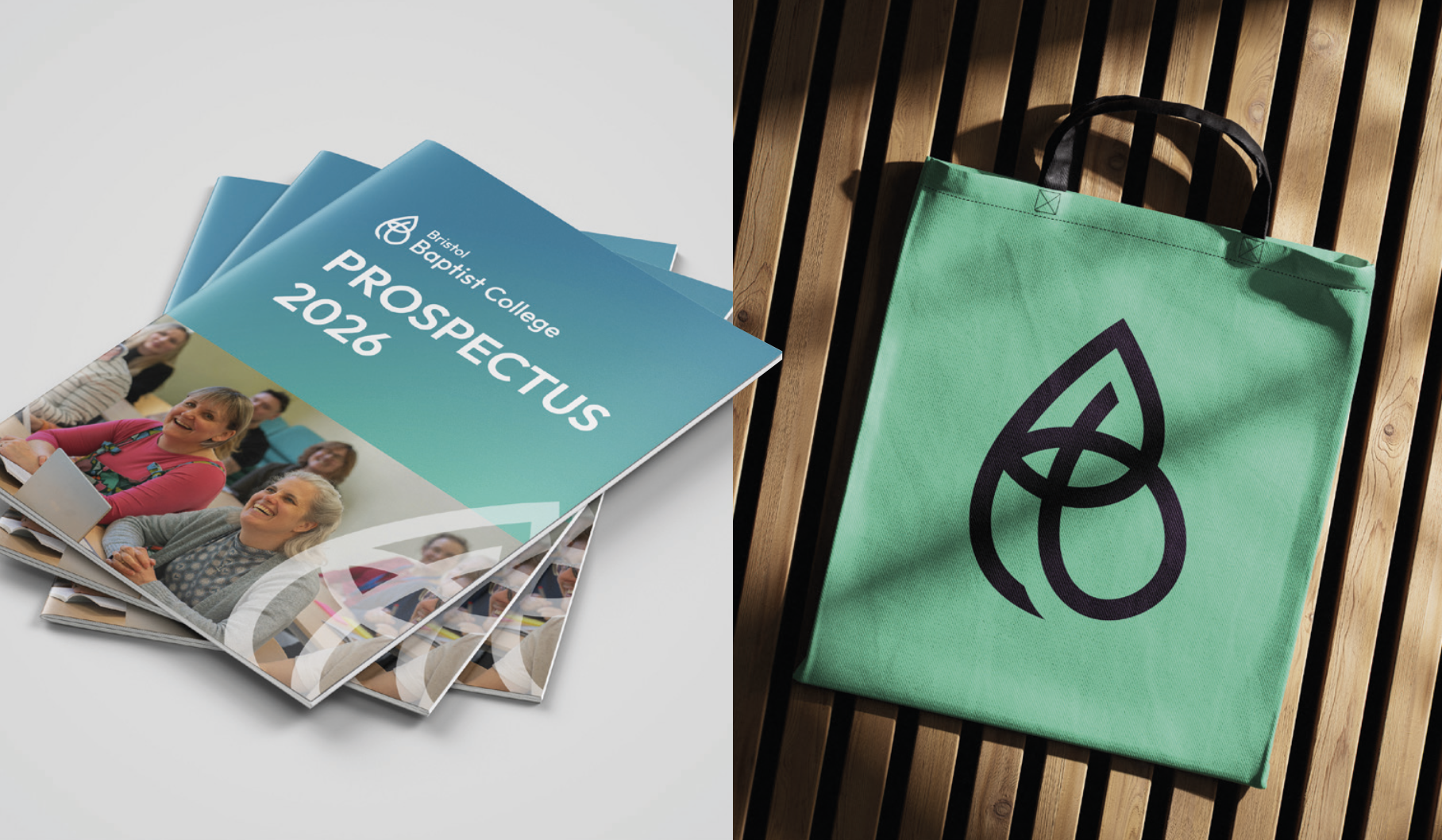
The logo took real thought to get right: a single mark holding a water drop for baptism, a B, a cross and an icthus fish, wrapped into something modern and robust. A diverse font family and refreshed colour palette rounded things off, helping the college feel both more professional and more welcoming at the same time.
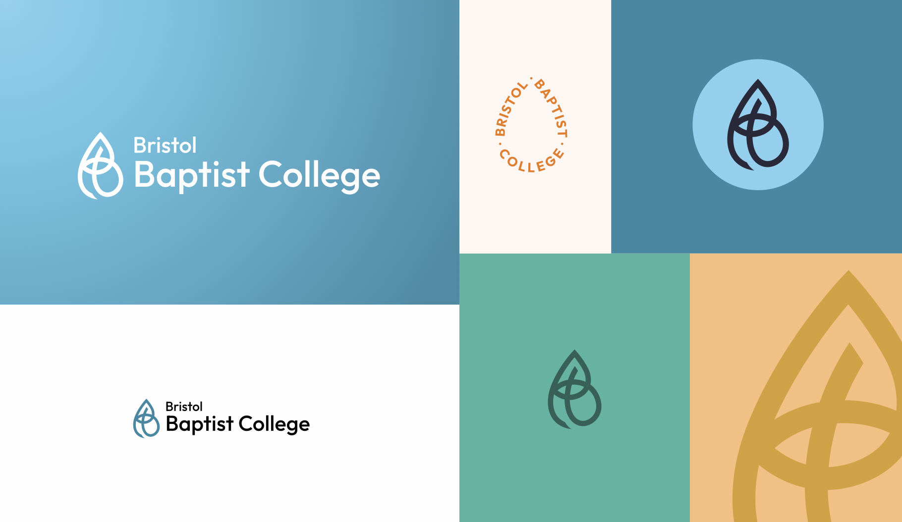
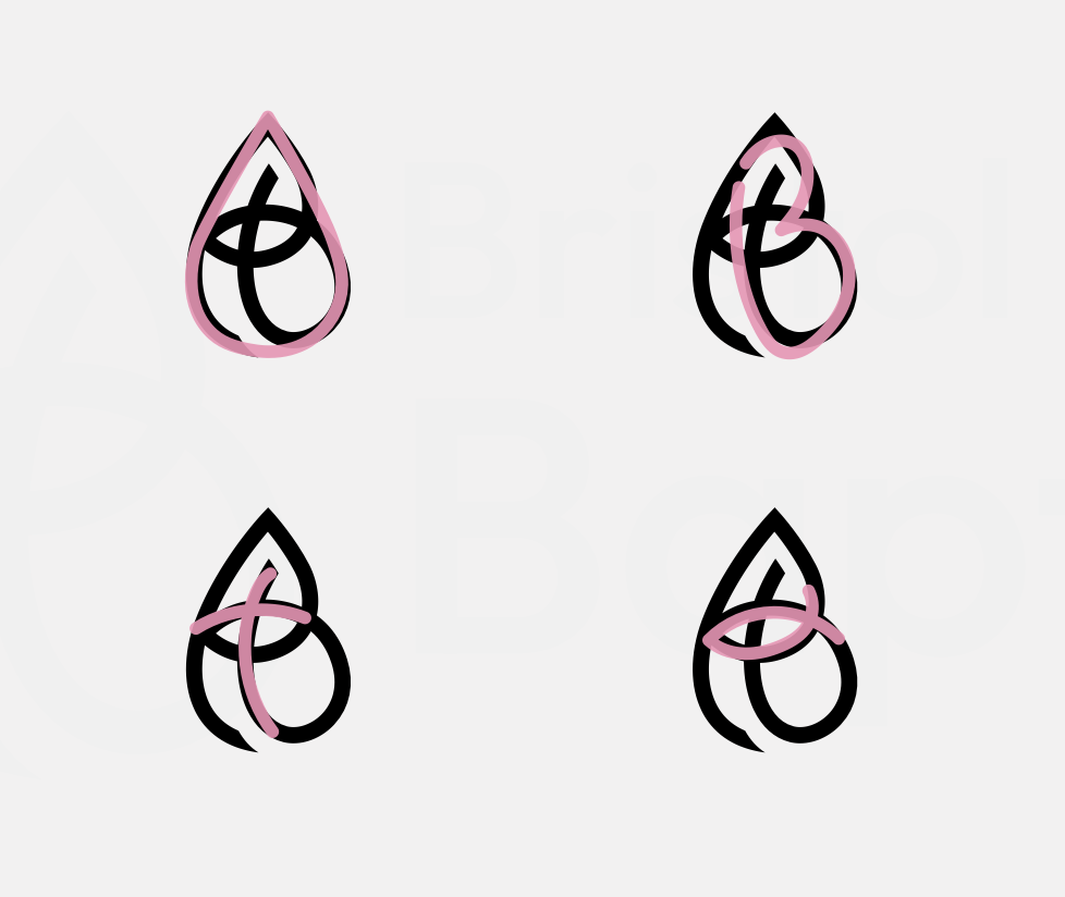
The logo successfully combines four important marks into one: The water drop shape for baptism, the B for Bristol, the cross and the icthus fish as symbols of Christian faith.
3 Assets
The strategy uncovered a tension worth solving: how do you communicate academic gravitas and genuine warmth in the same breath? The answer was found in Bob, the brand persona at the heart of the messaging. (Think of your favourite university professor: knowledgeable, a little eccentric, and thoroughly relatable.)
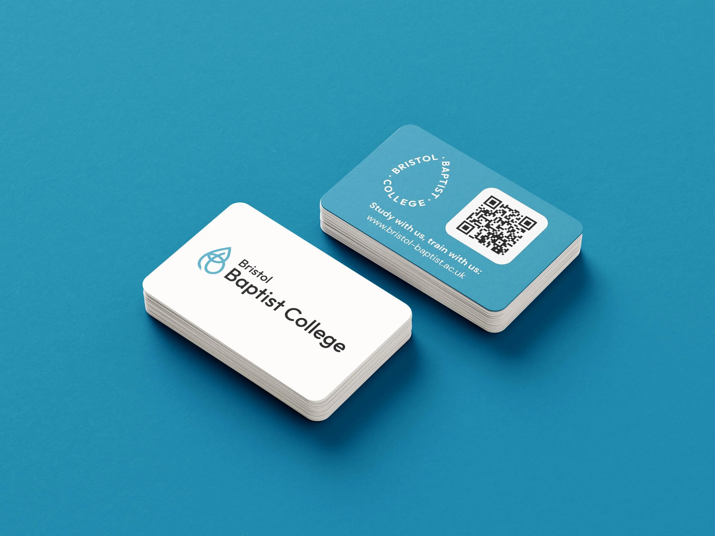
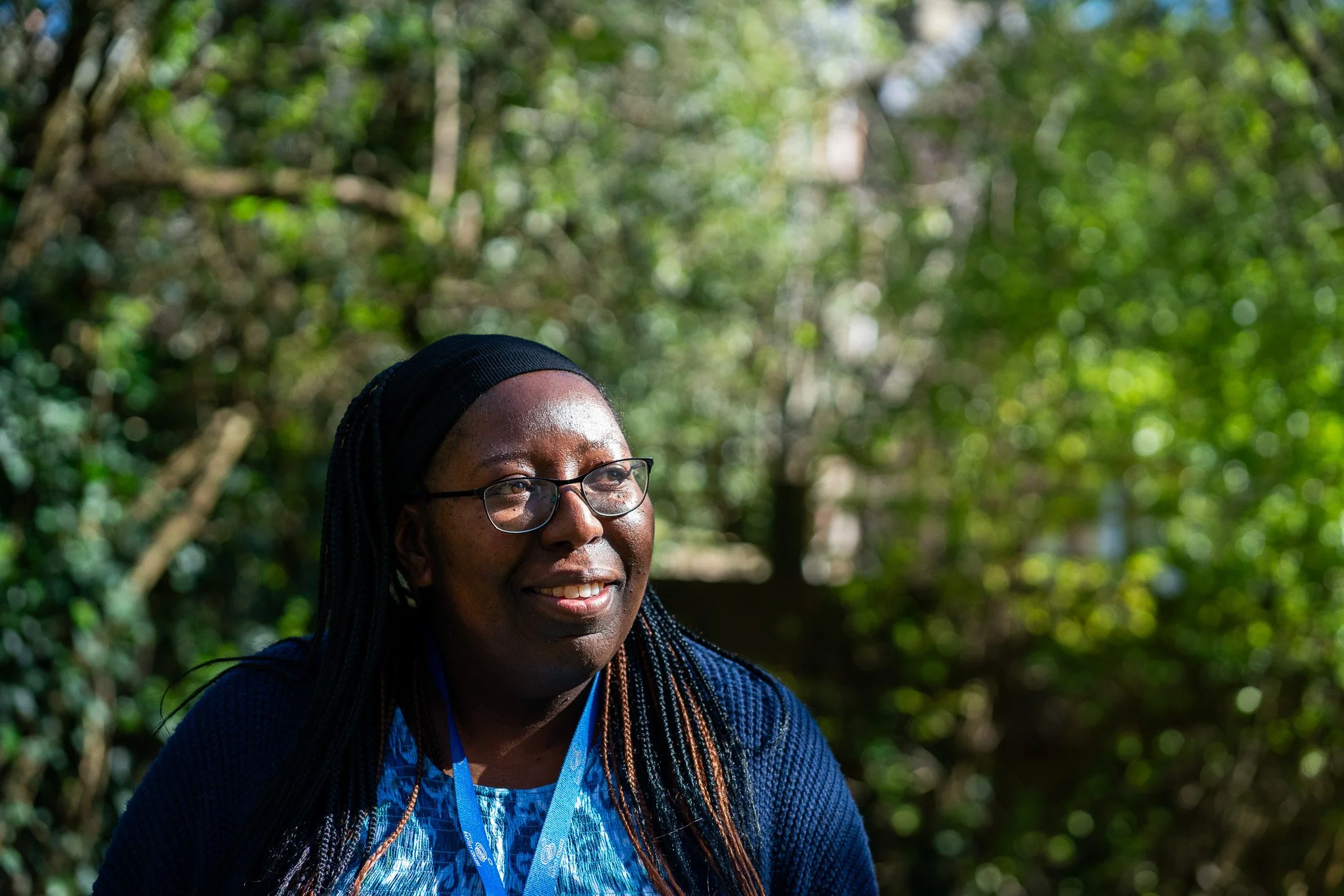
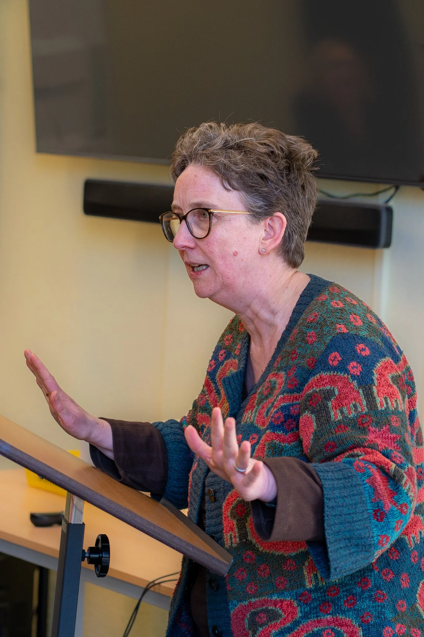
With the messaging in place, we turned to the visual assets. New photography shifted the focus from buildings to people, capturing the community that makes the college special. This was all translated into a suite of creative assets developed in Canva, complete with a team training session.
4 Website
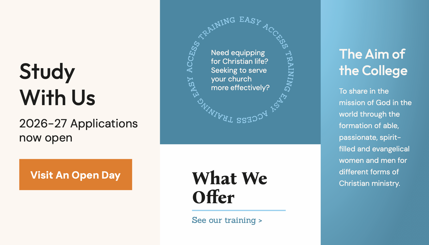
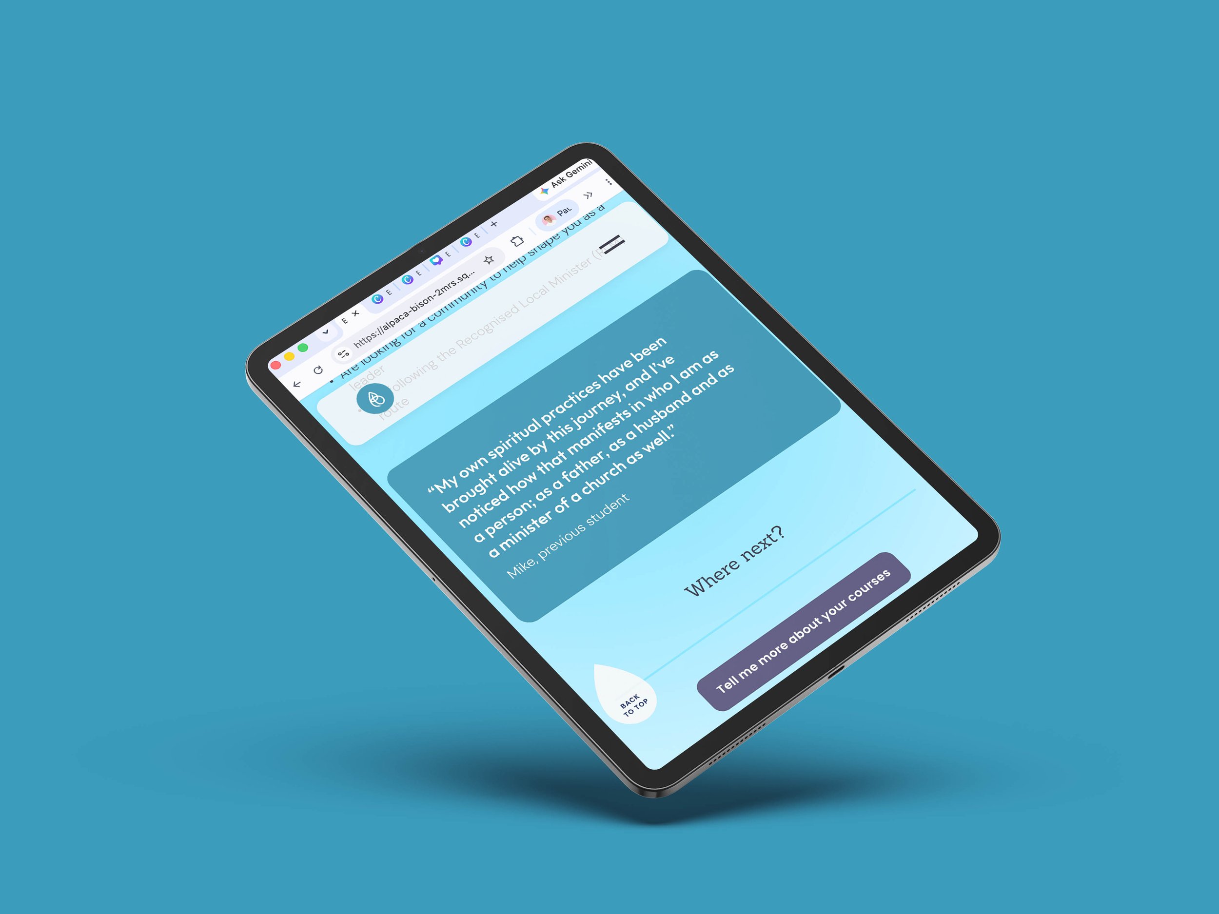
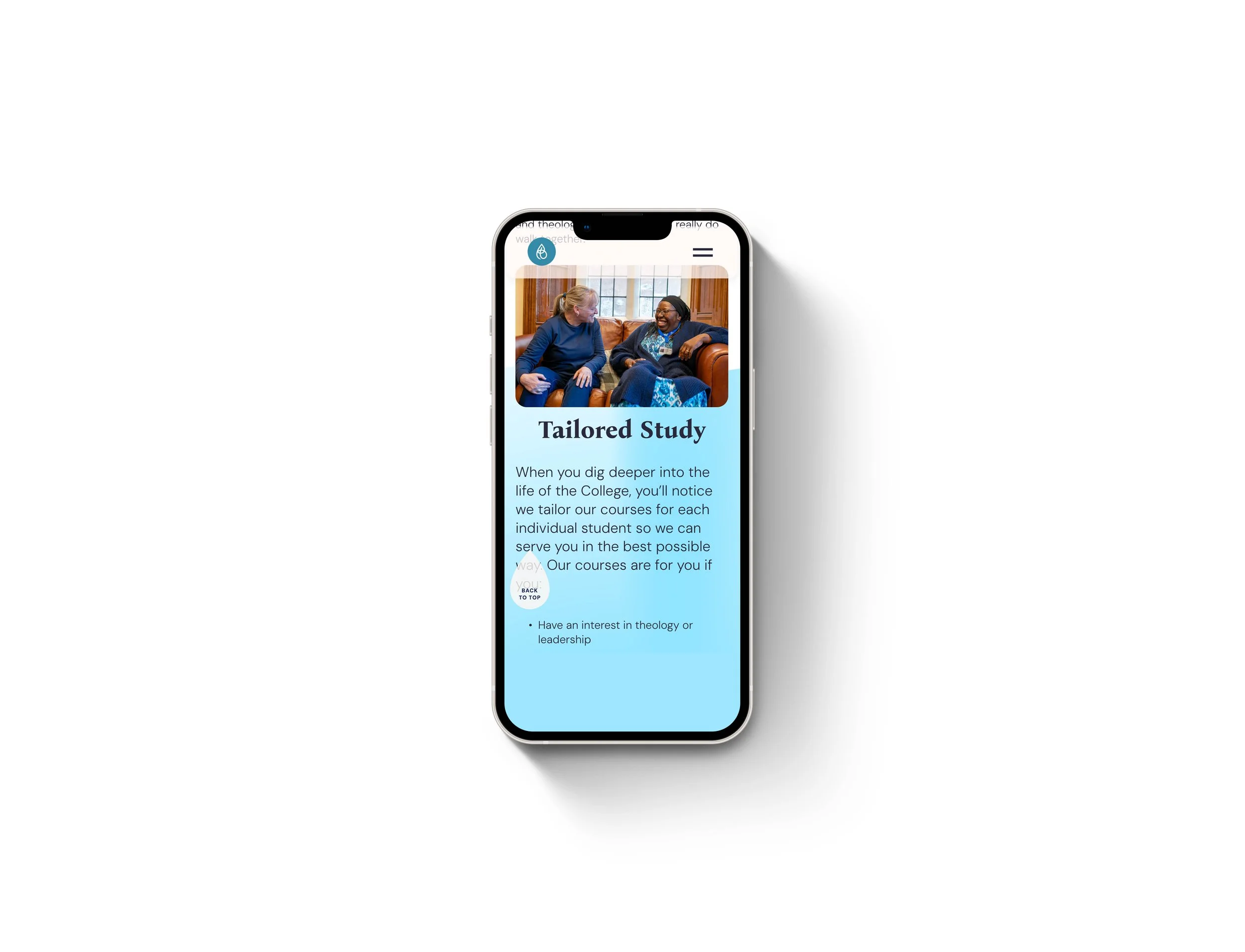
Finally, we developed a new website, designed with recruitment firmly in mind. Beautiful to look at, but built to work hard too.
Websites are a big moment, pulling together all the previous elements of work into one visible location: the brand strategy, messaging, photography and visual identity.
We were incredibly proud to launch this optimised website which was a breath of fresh air, targeting the recruitment of new, younger students while proudly communicating the heart of the college in a meaningful and relevant way.
The Result
The site has only just launched, but early feedback is already glowing, particularly for how well it resonates with prospective students under 30, all while holding firm on accessibility and functionality.
A brand that finally matches the heart of the college, ready to welcome the next 300 years.